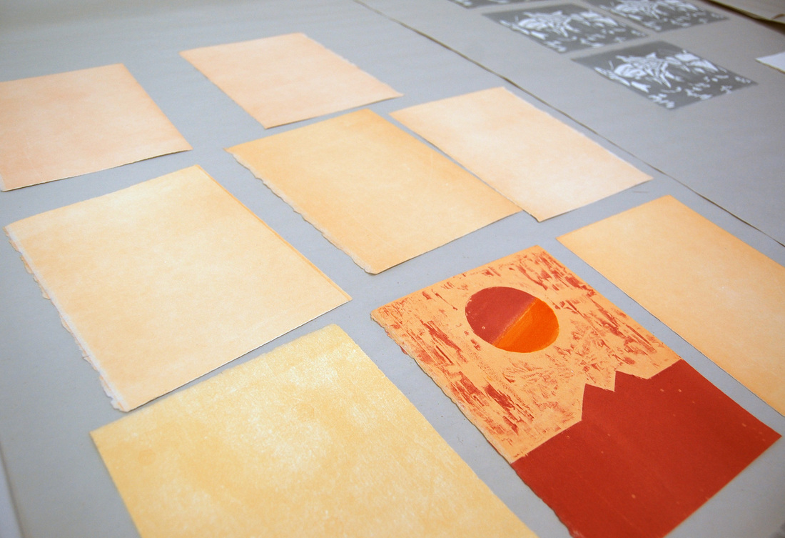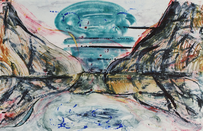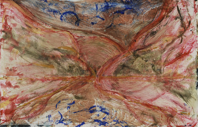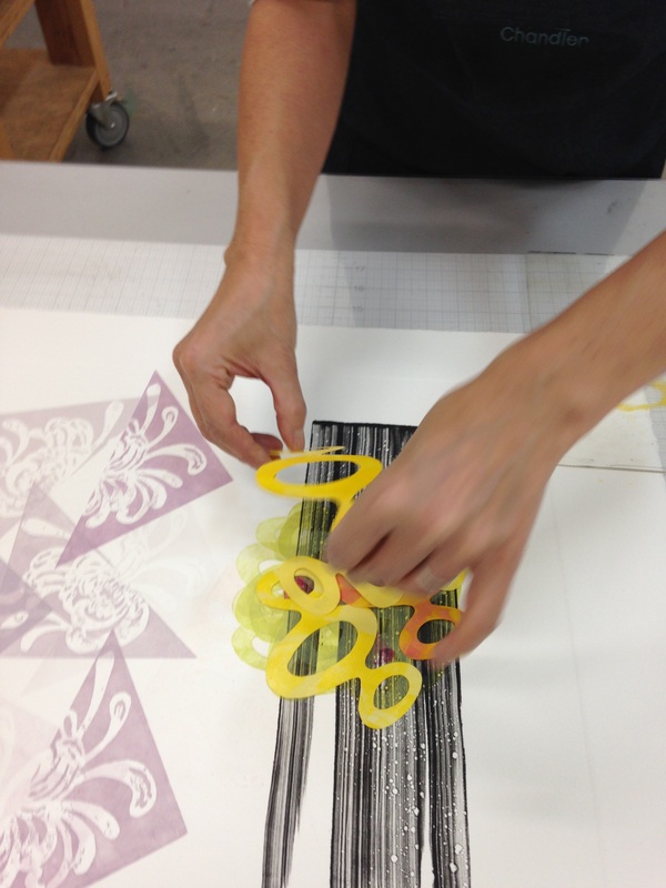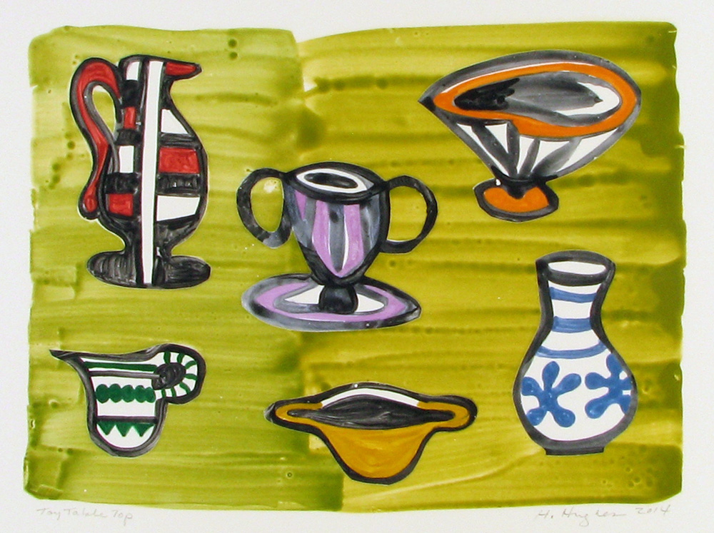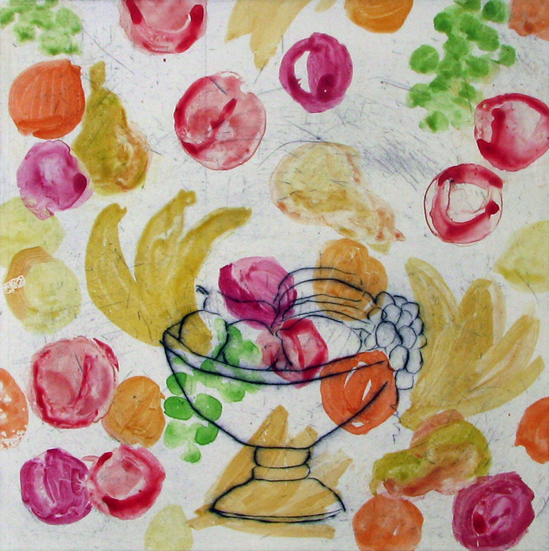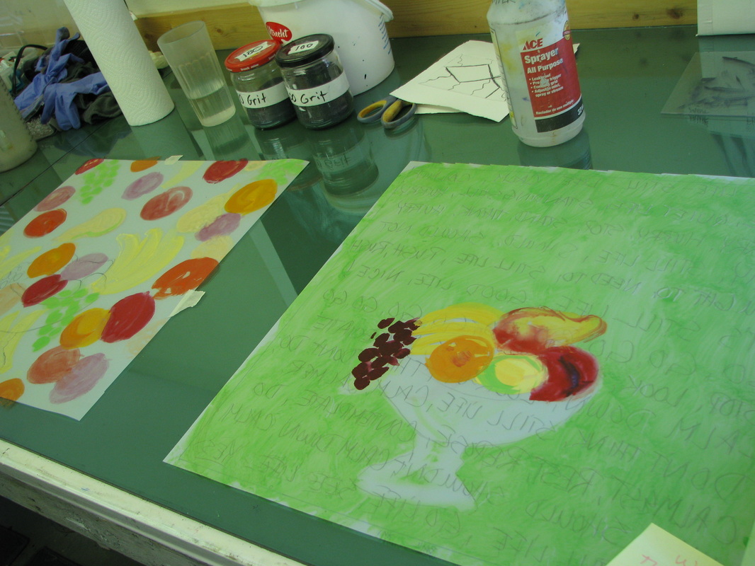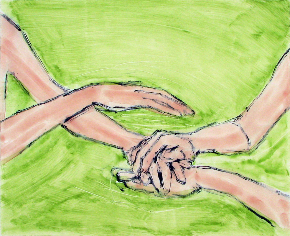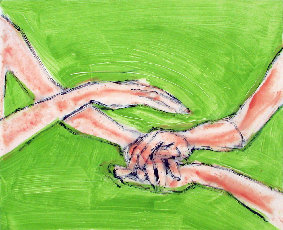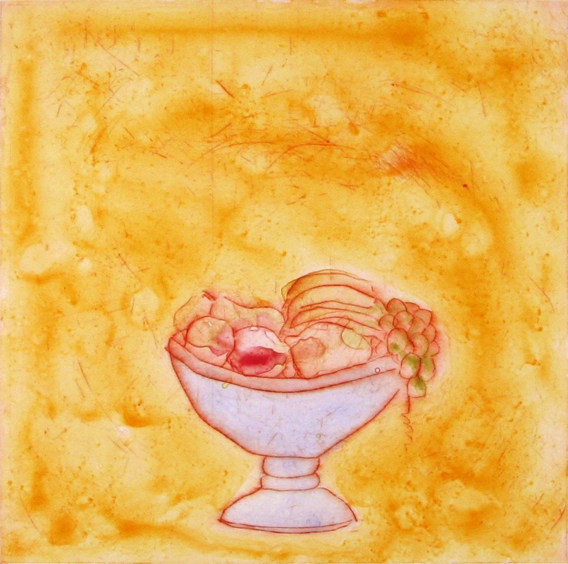
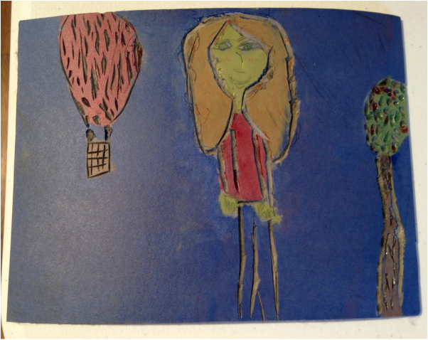
This summer Oehme Graphics held a printmaking camp at the Art Depot in Steamboat Springs. It was a busy week in which the campers learned many printmaking techniques and were able to produce a large portfolio of prints! The week started with watercolor monotypes on vellum and drypoints on plexiglass plates. This first project introduced the students to the complexities of registering an image between two plates, as they had to line up their watercolors with their drypoints so that the images would correlate in the final print. Here's one of the watercolor monotypes with drypoint.
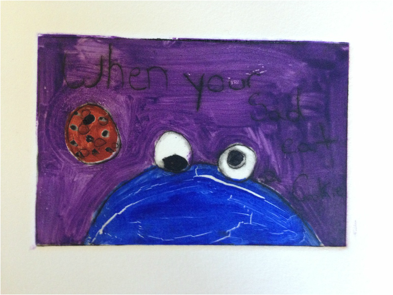
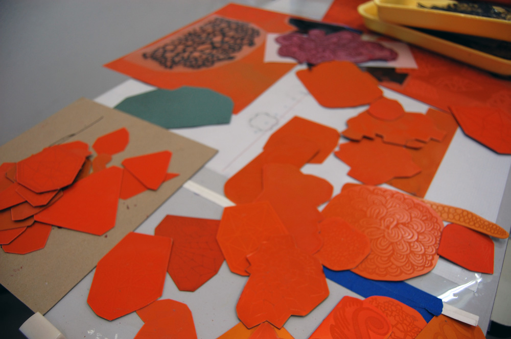
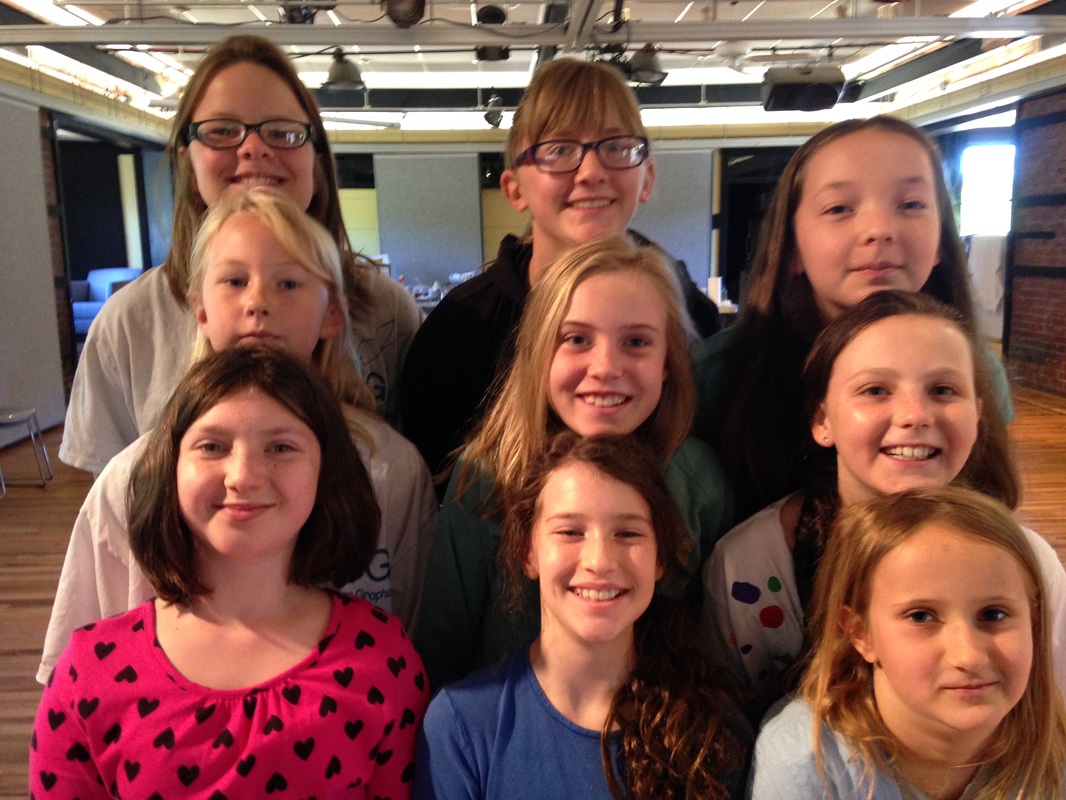
The cookie monster was a reoccurring theme throughout the week! The second day we continued the monotypes and drypoints and began working on collograph plates. The campers had fun outside collecting leaves, sticks, and other natural findings to glue to the plates.
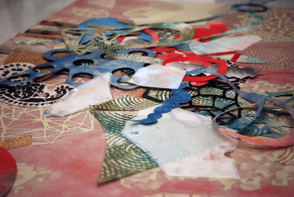
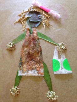 Here is an inventive collograph plate that contains many elements from nature that were cut, altered, and glued down. | 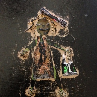 This is the same plate after being flattened under the press and inked. Ready to print! |
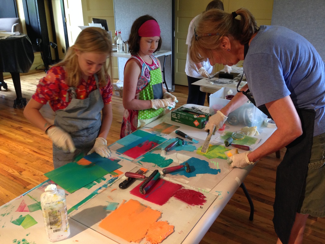
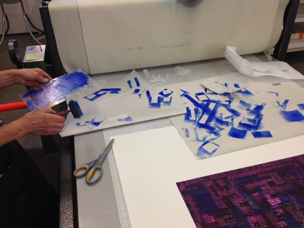
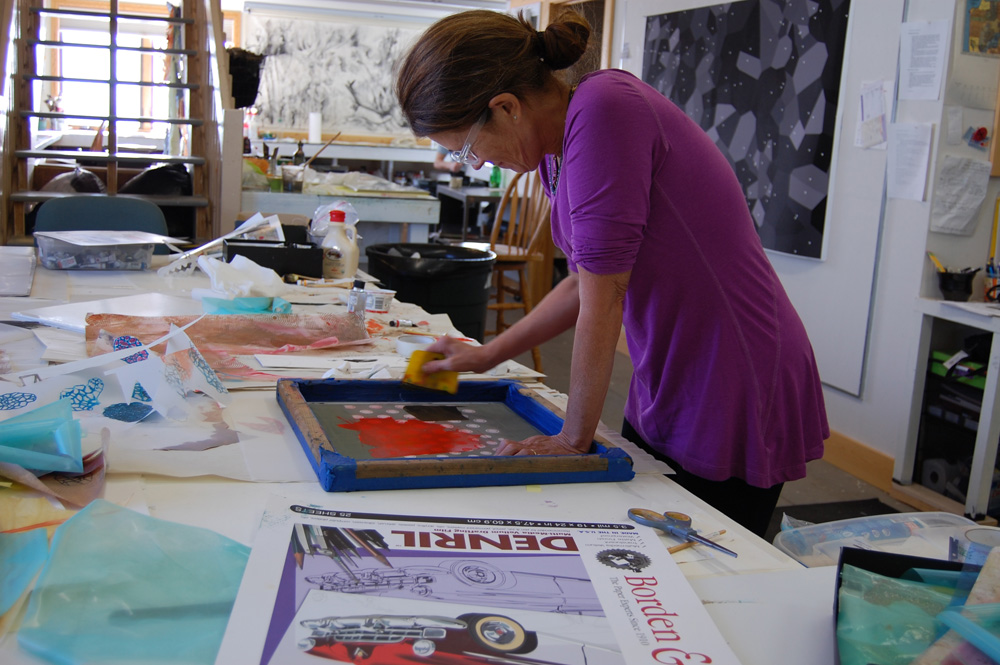
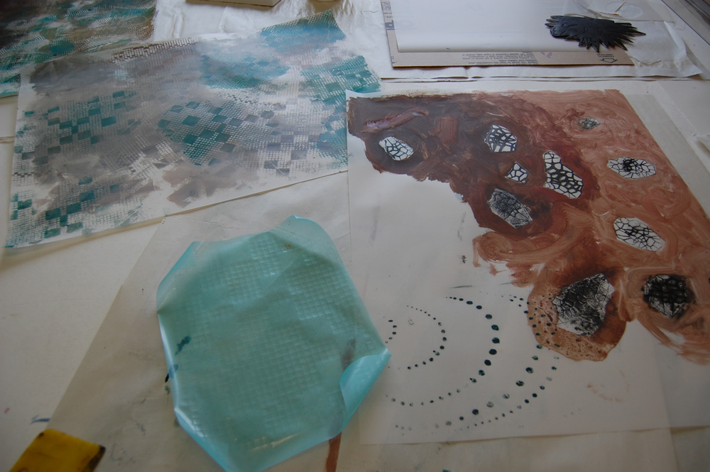
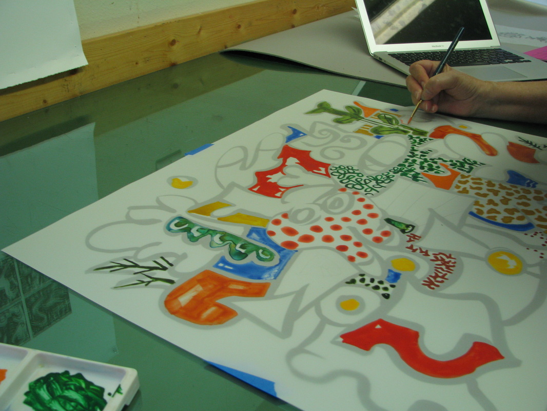
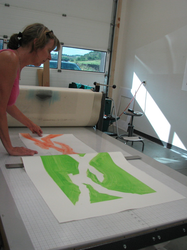
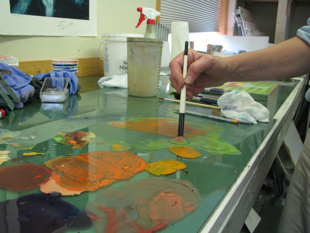
Another fun technique we explored was relief rolling. We rolled out many colorful inks and the campers each got their own plexiglass plate to roll the inks on as they liked. After rolling, campers used Q-tips, paper towels, and other experimental methods to draw by wiping away ink from the plate.
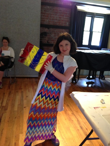
A camper holds up her plexiglass plate. The backside faces us because when the ink on the other side is printed the writing will read in the right direction. It seems that our campers are colorful printers as well as colorful dressers!
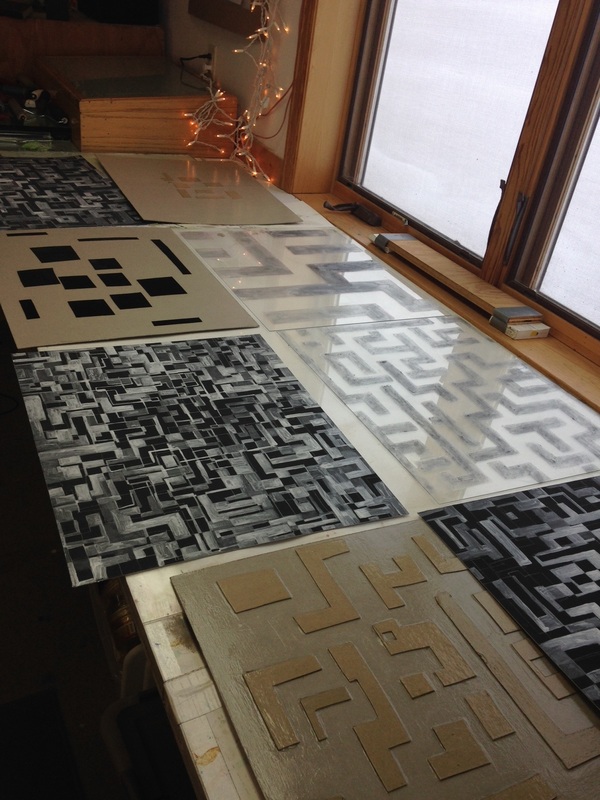
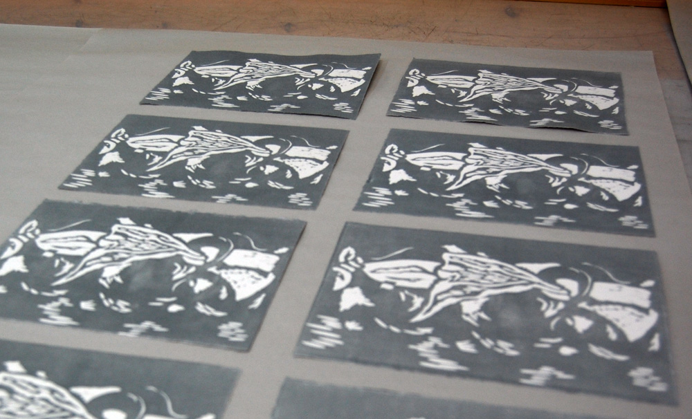
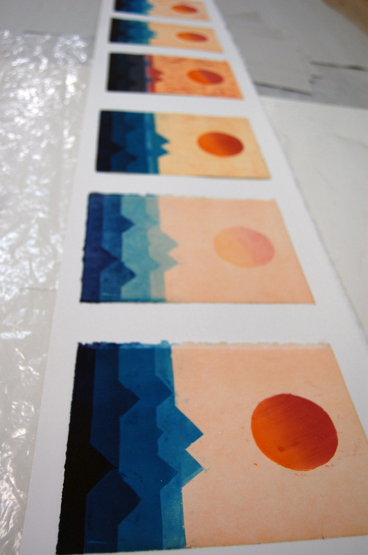
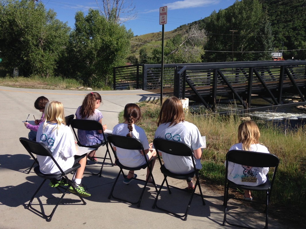
Our last two print processes were linocuts on linoleum blocks and etchings on copper plates. The campers drew inspiration from Steamboat by sketching the summer scenery surrounding the Art Depot. One of the scenes was a bridge over the nearby Yampa river.
Our last two print processes were linocuts on linoleum blocks and etchings on copper plates. The campers drew inspiration from Steamboat by sketching the summer scenery surrounding the Art Depot. One of the scenes was a bridge over the nearby Yampa river.
The linoleum blocks were carved away and relief rolled to create the final image. While the campers were carving, Oehme Graphics intern, Alex, read some folk tales from Native American folklore that captivated our campers' ears.
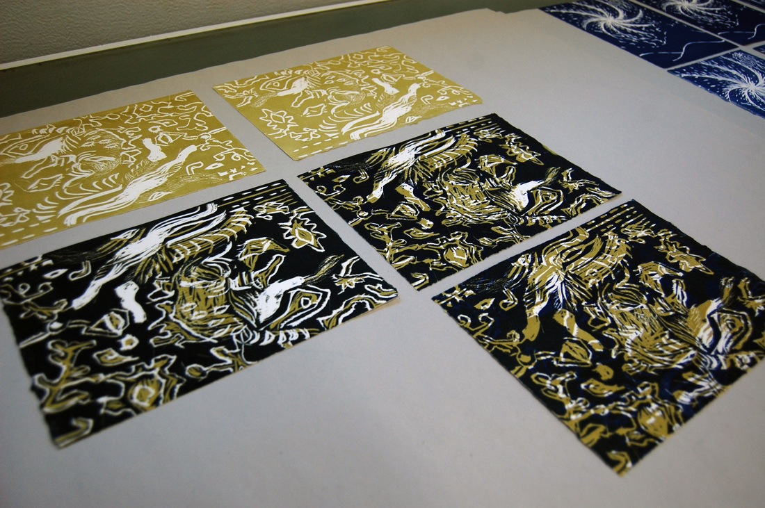
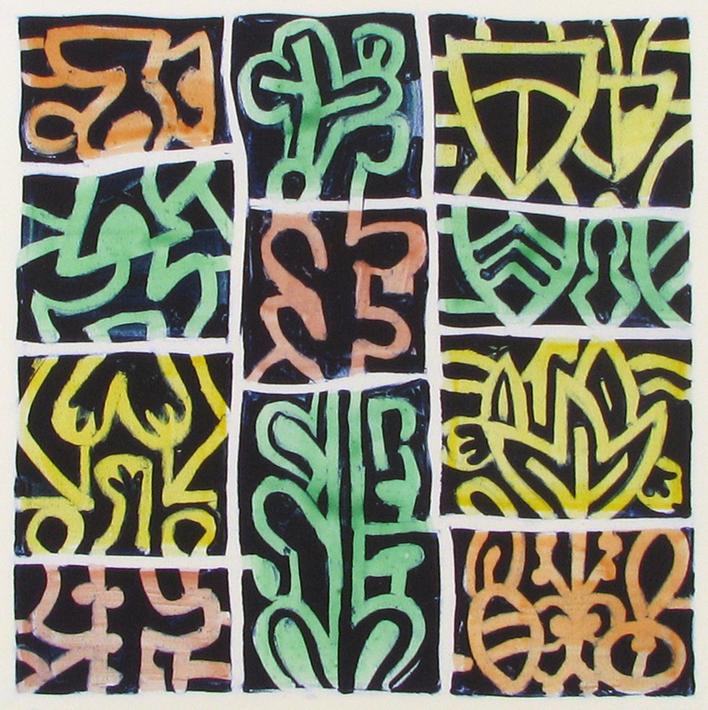
 |  A finished linocut print with selective inking, which means that the colored ink is applied to specific areas as opposed to being rolled over the entire block. |
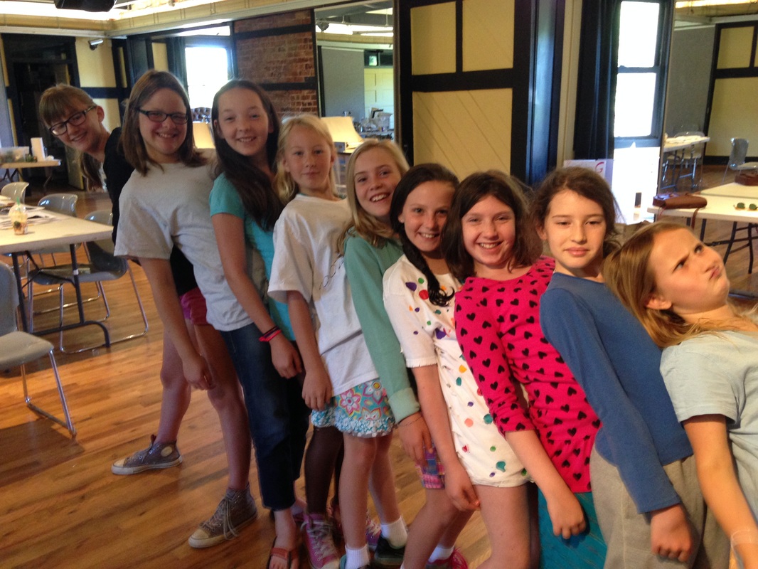
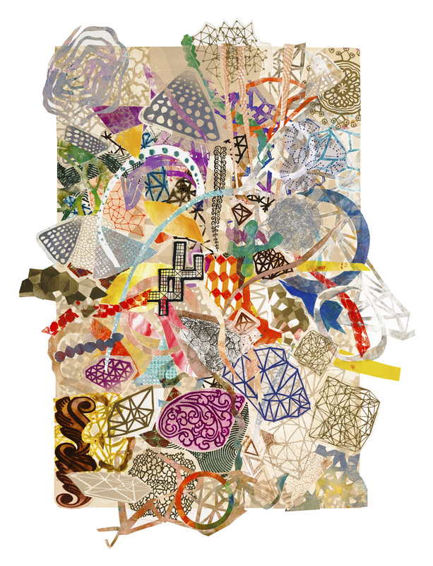
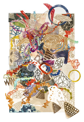
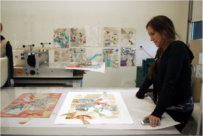
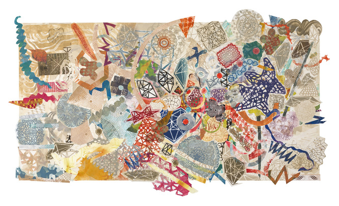
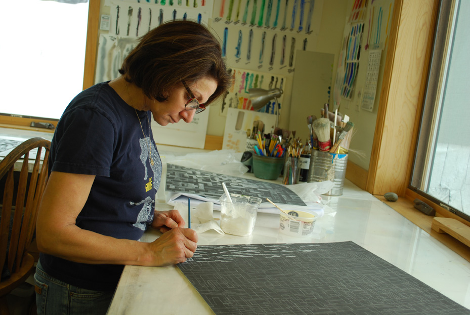
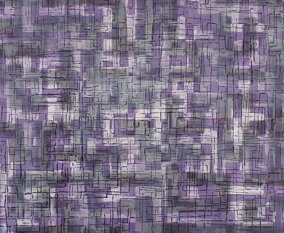
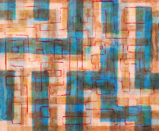
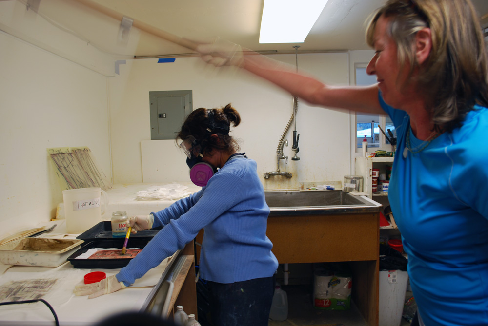
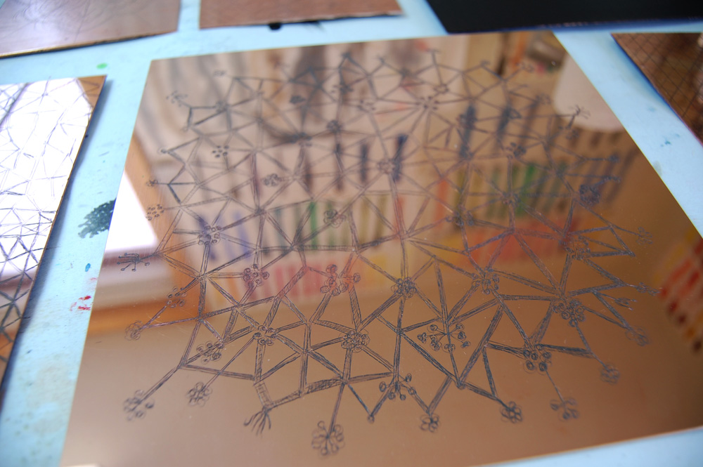
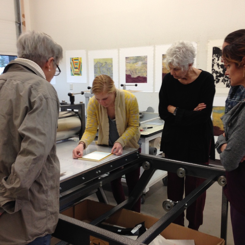
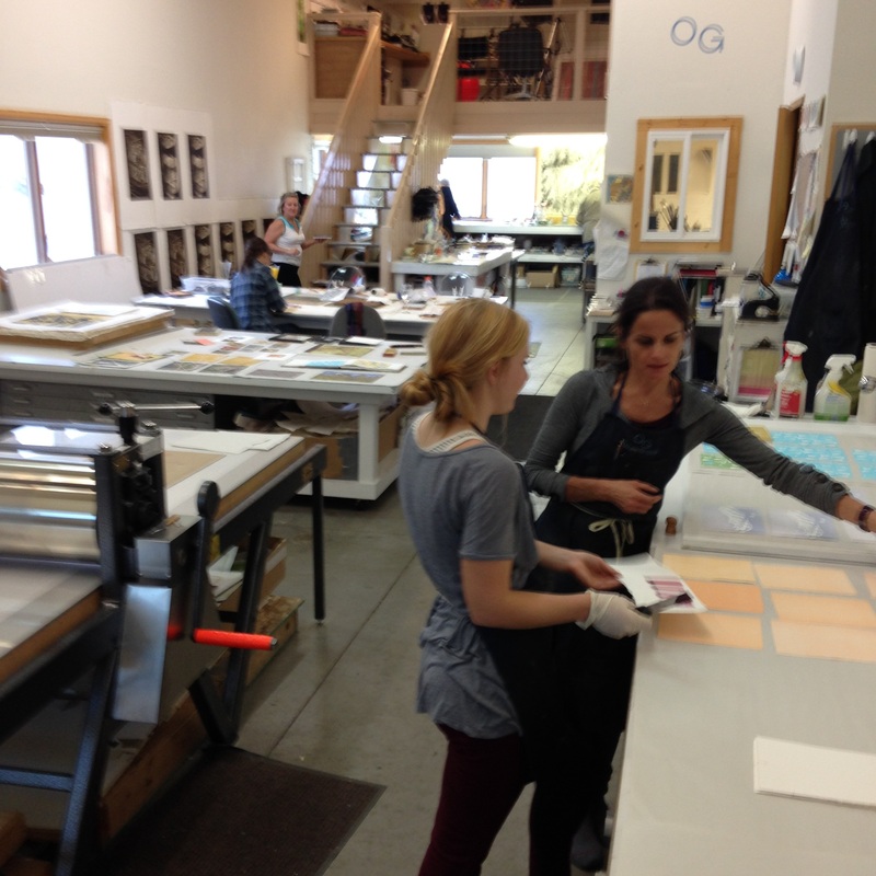
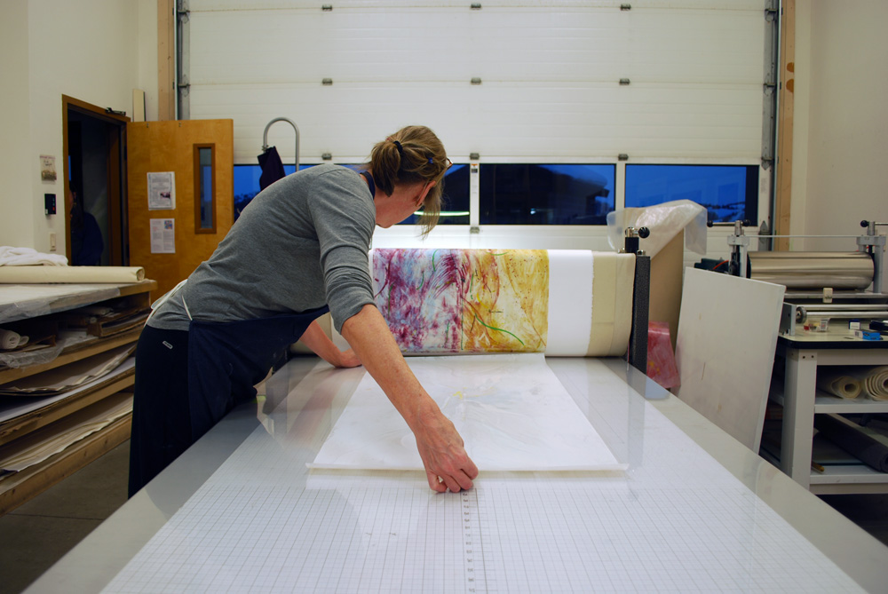
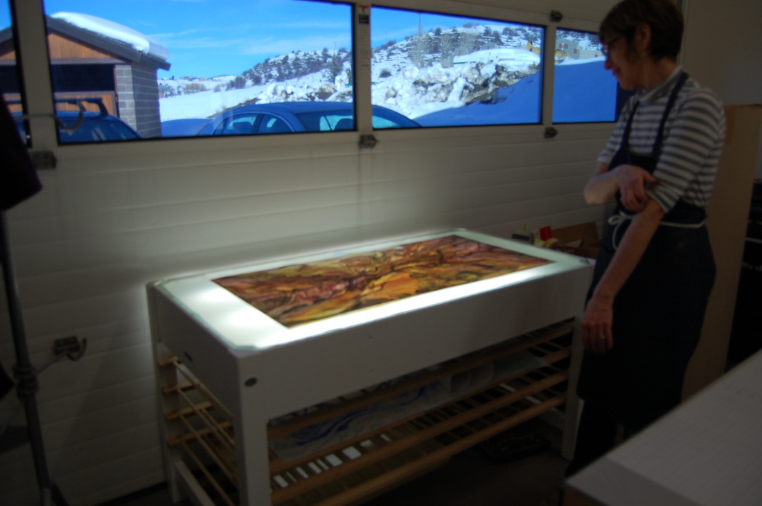
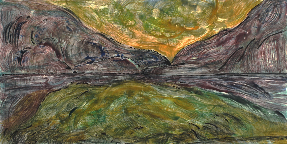
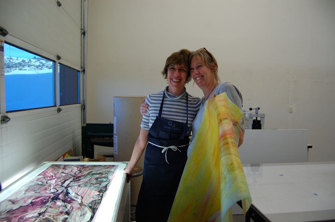
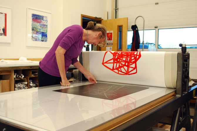
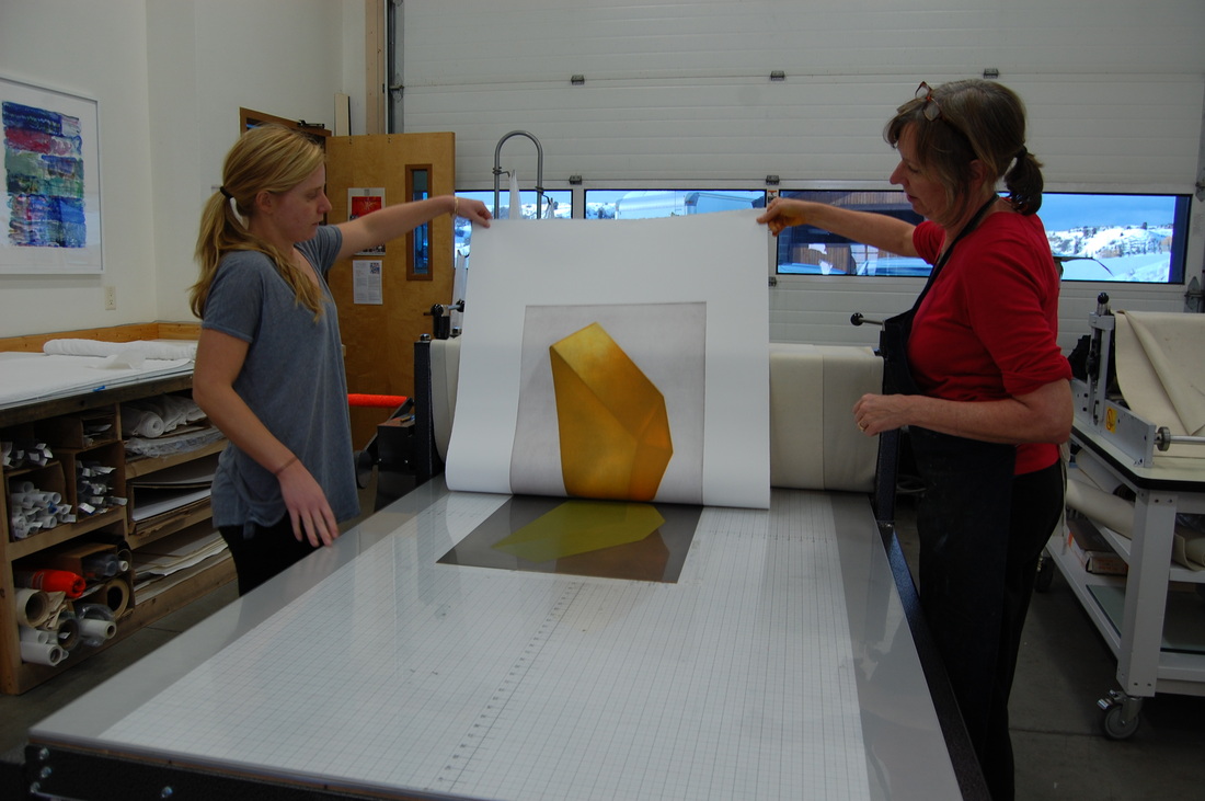
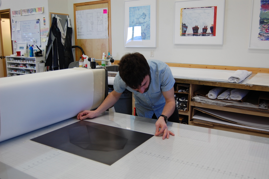
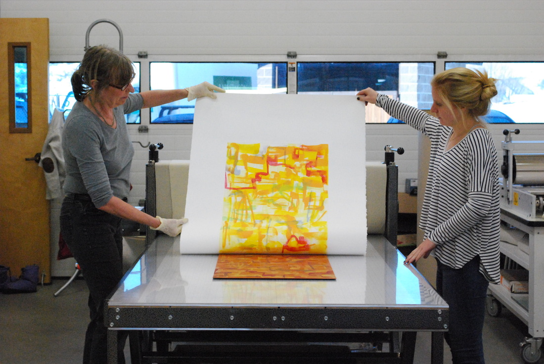
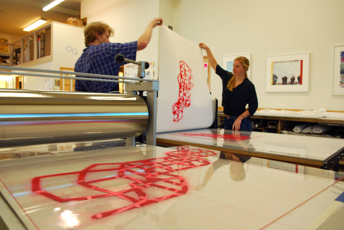
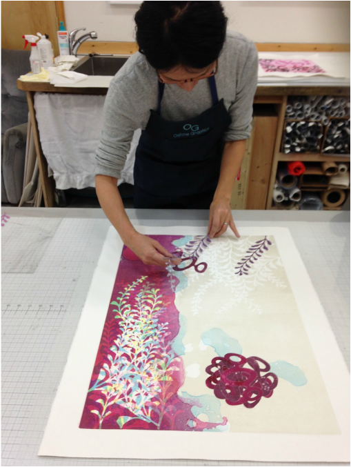
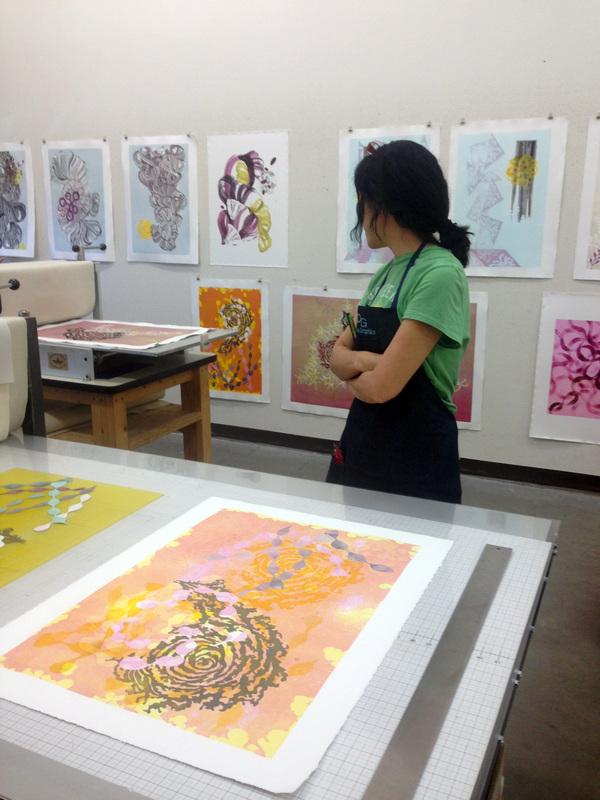
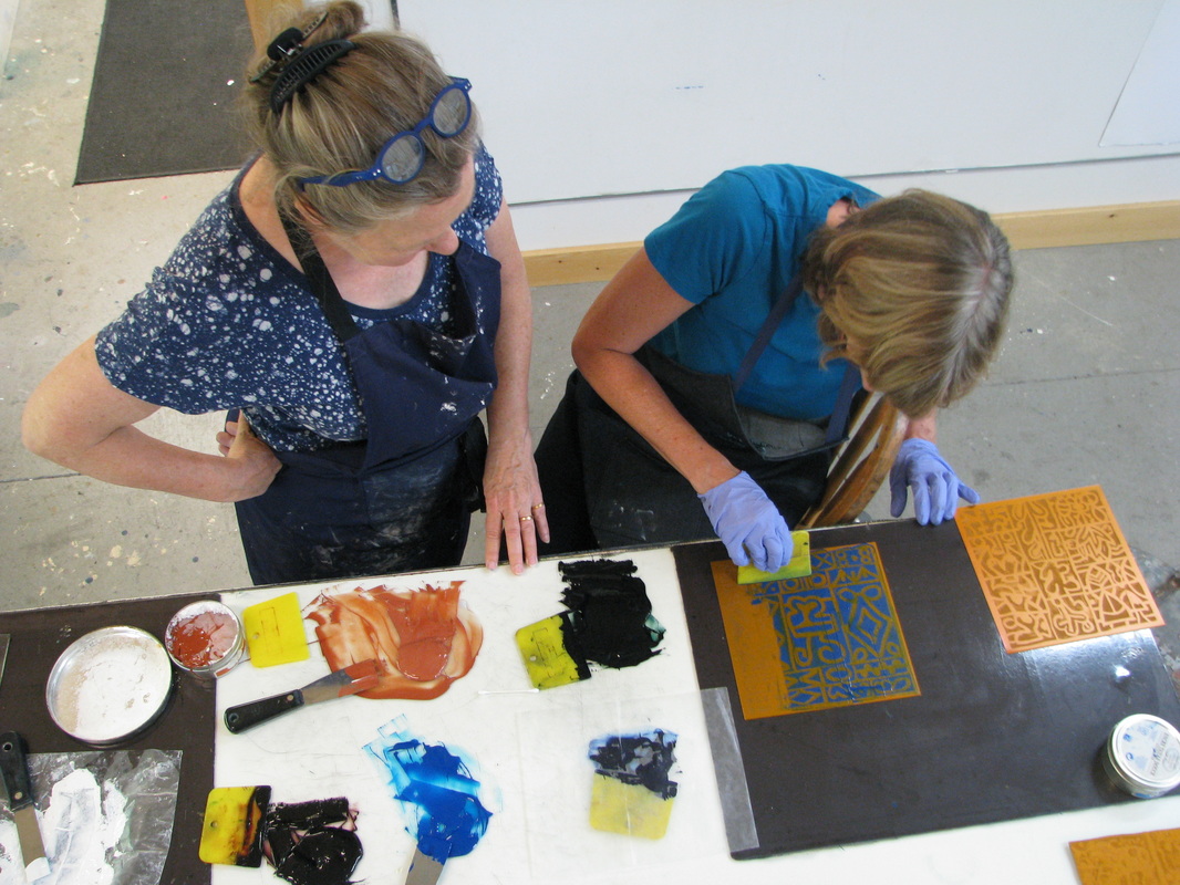
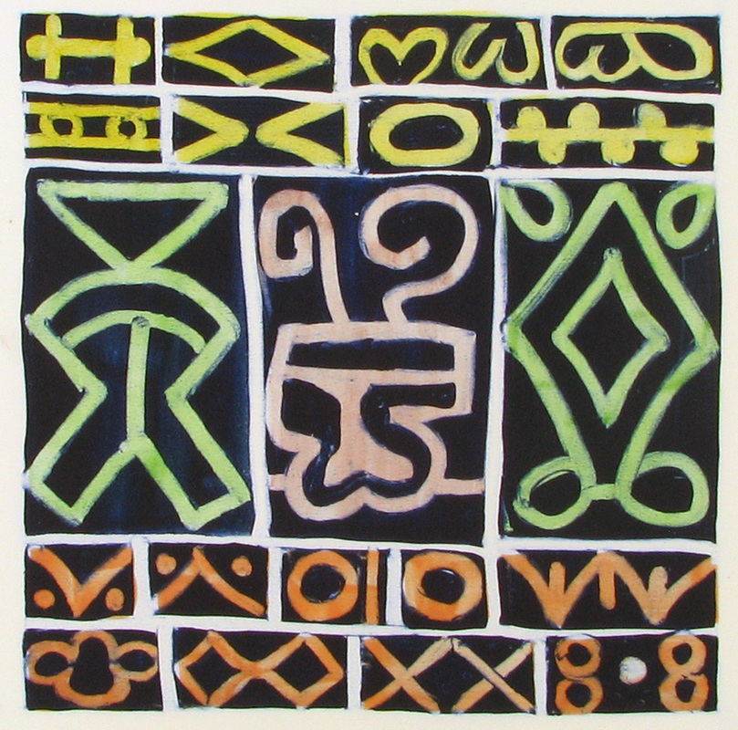
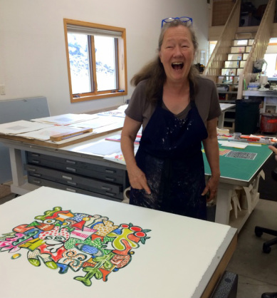
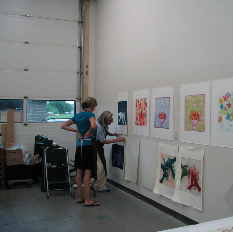
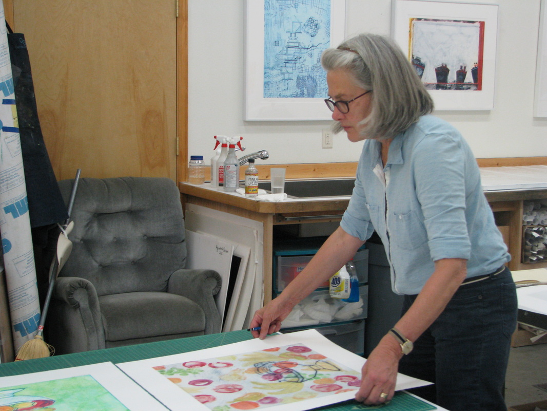
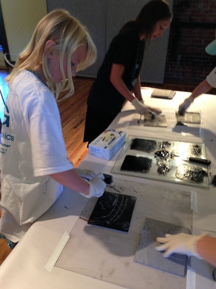
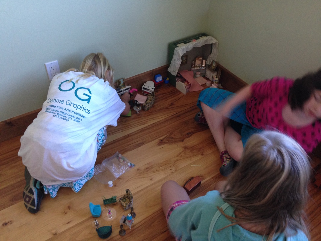
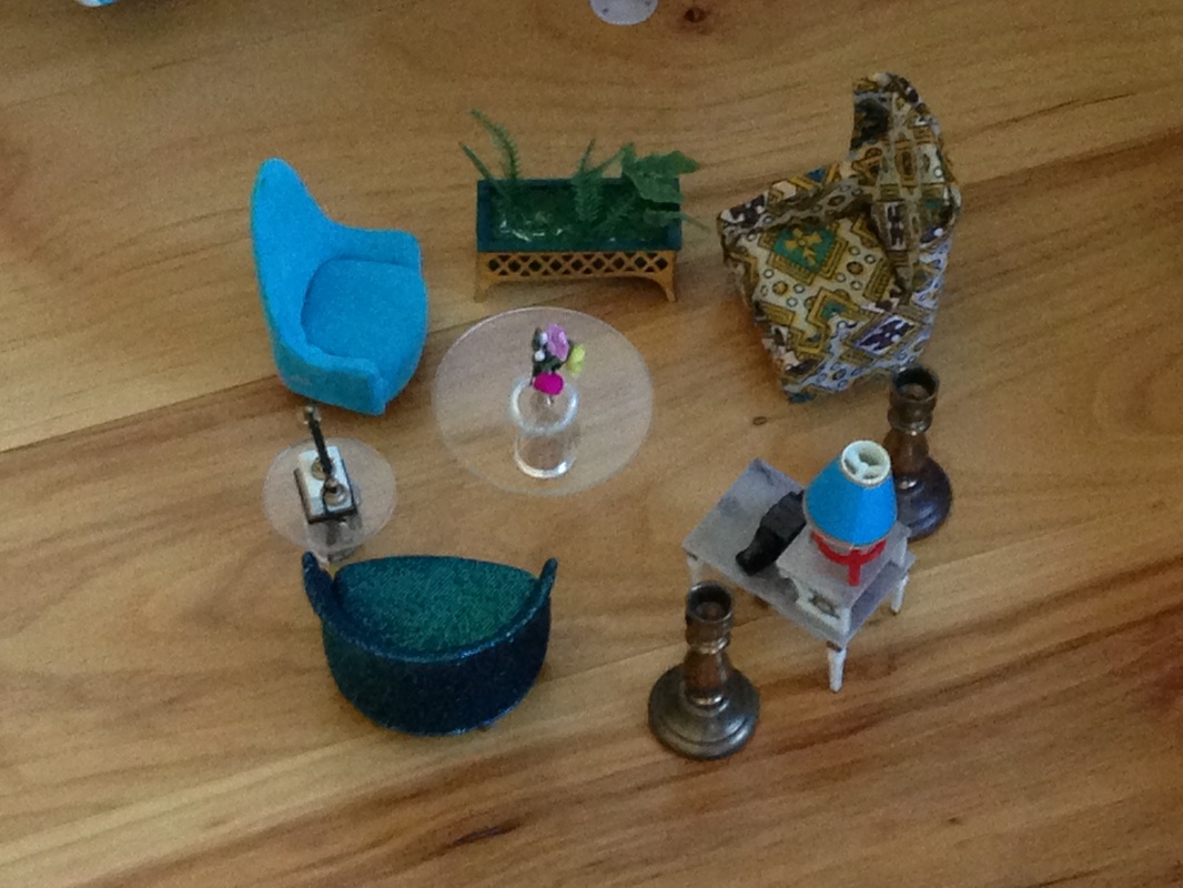
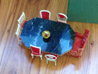
After the copper plates were covered in hard ground and drawn into by our campers, they were etched in a ferric chloride bath. Friday was a busy day for all, as the campers took a field trip to the Oehme Graphics studio to see how the copper plates are etched. The campers also saw the gallery at Oehme Graphics, where Sue showed them some of the artists' prints that were created at Oehme Graphics. Sue also let the campers play with a doll house that had been passed down through her family. They were very creative in designing miniature rooms!
 |  |
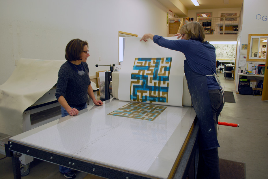
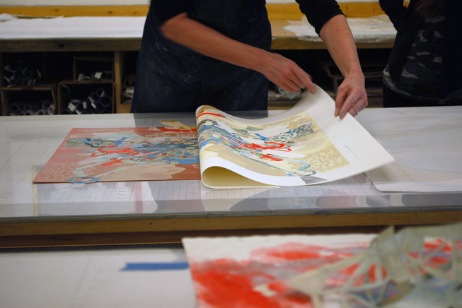
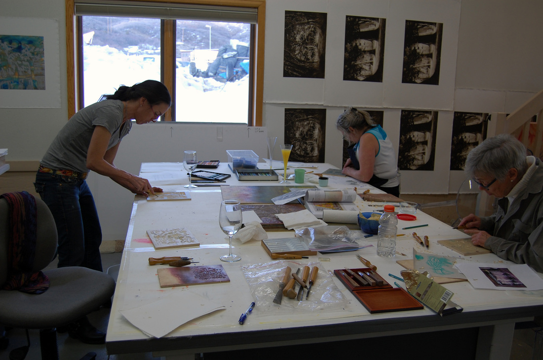
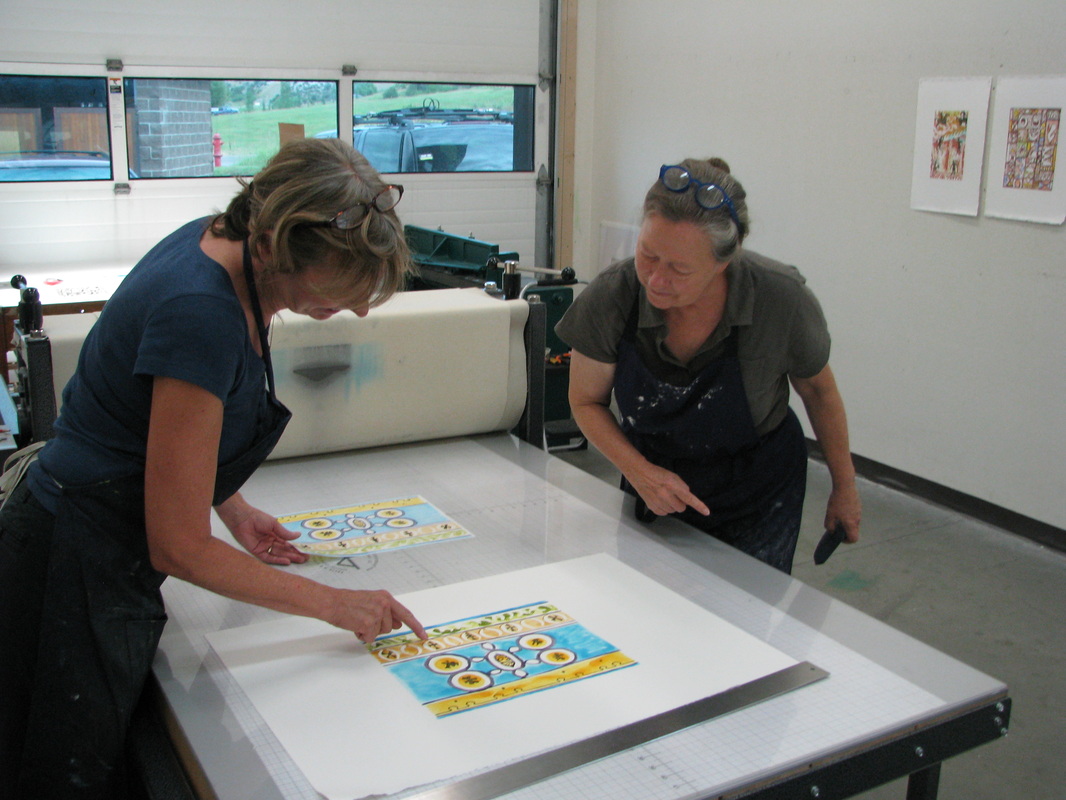
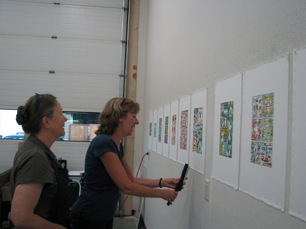
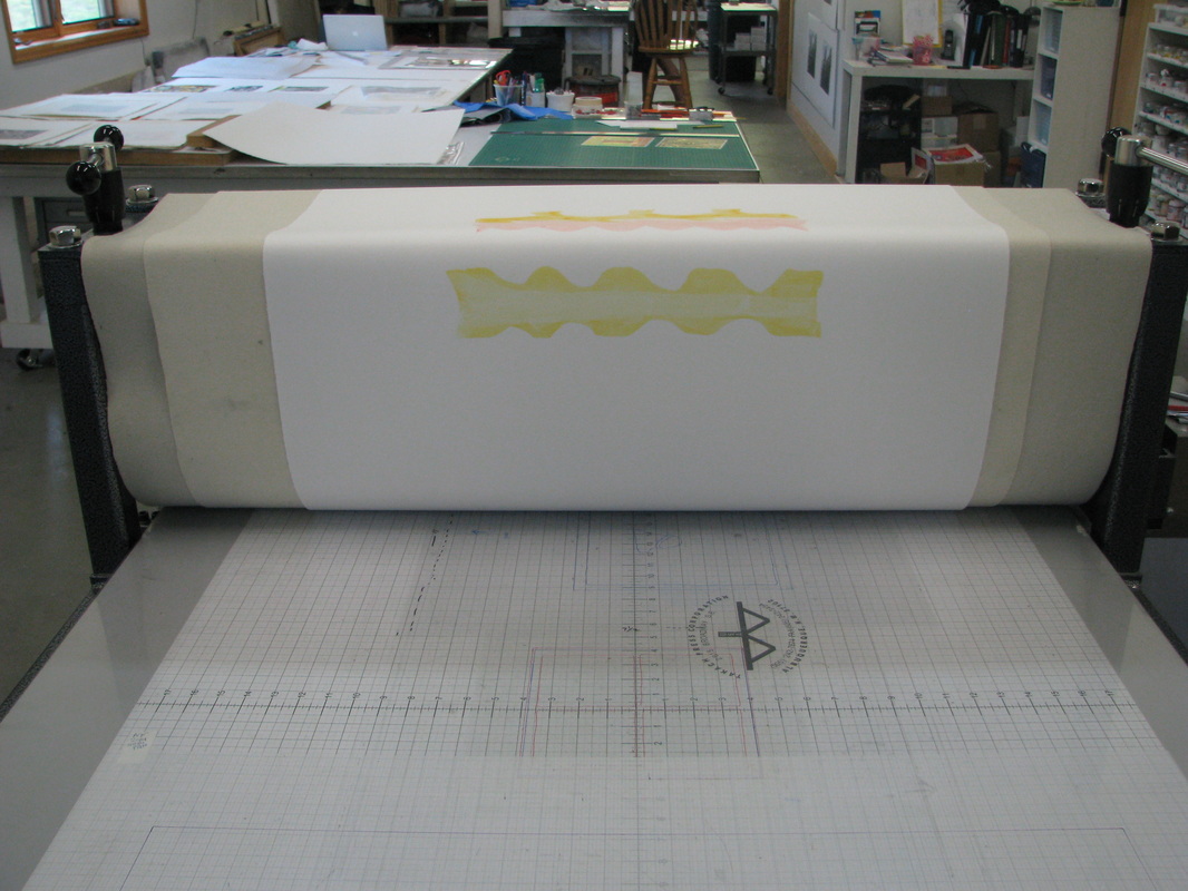
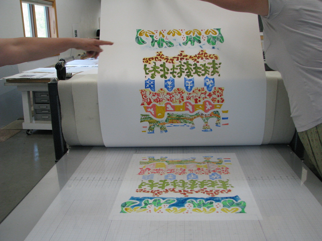
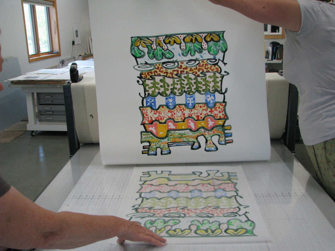
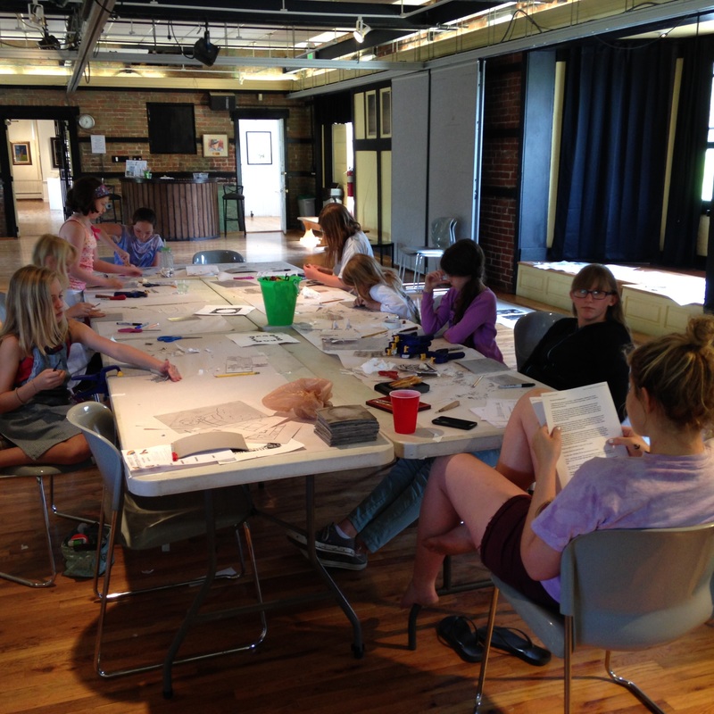
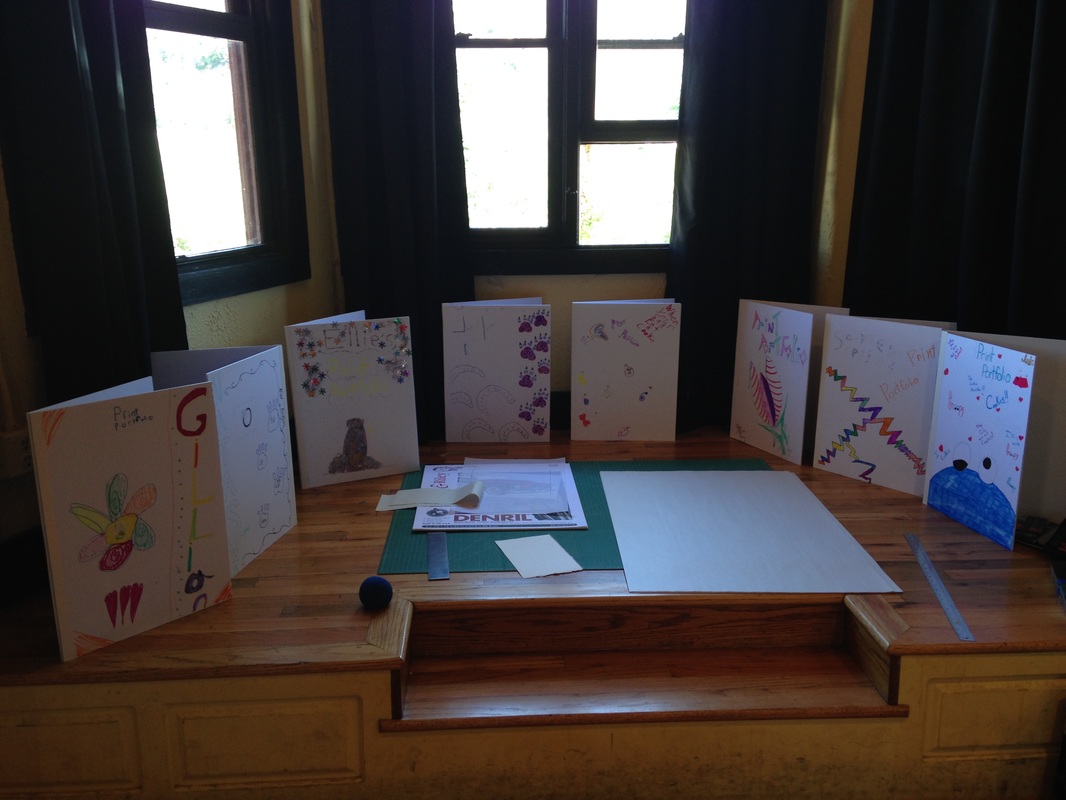
After the trip to OG, we all returned to the Depot where we printed up a storm. While the etchings were being printed, the campers decorated their own portfolios for storing their prints and prepared for a final critique.
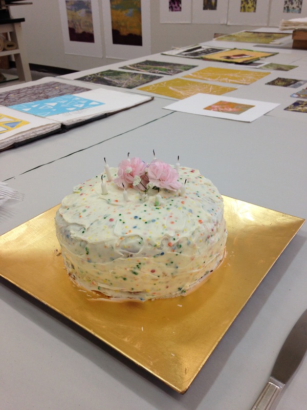
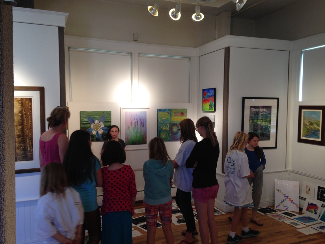
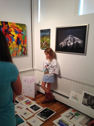
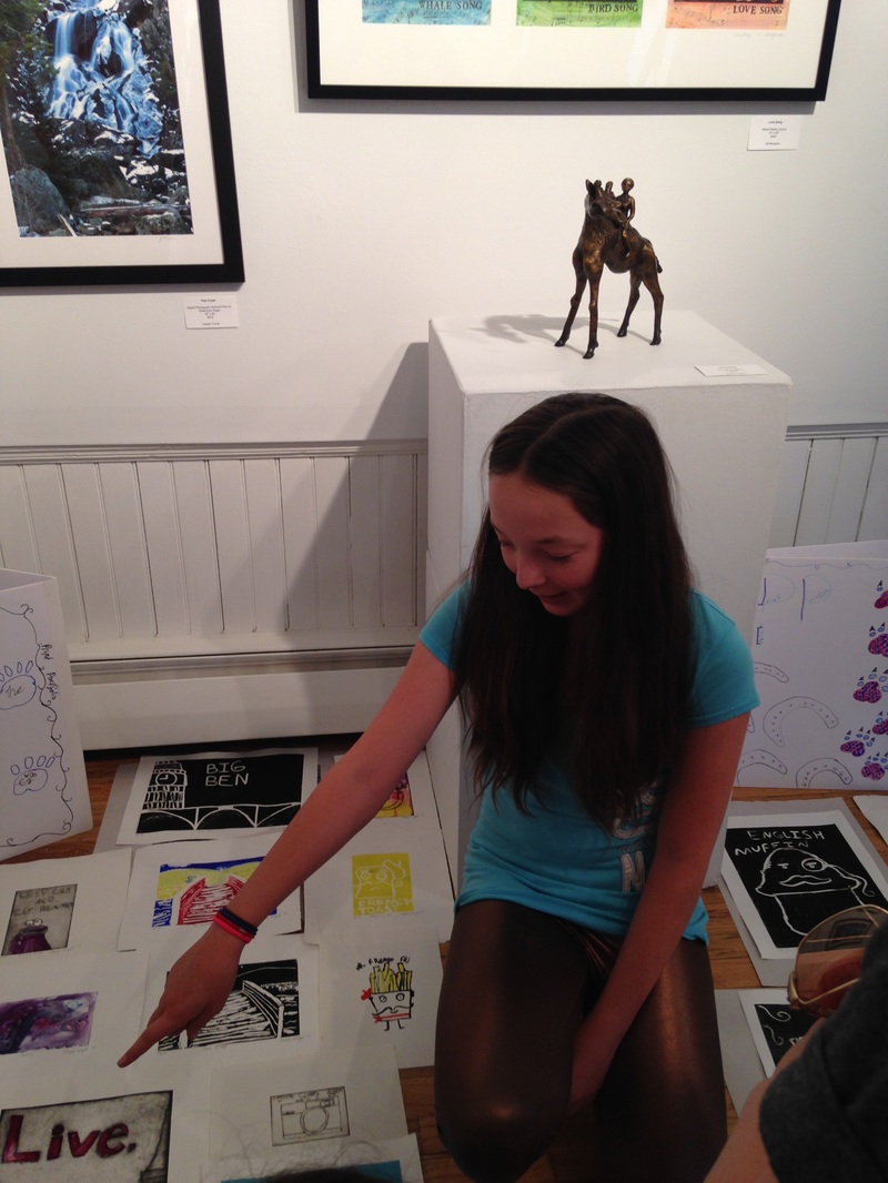
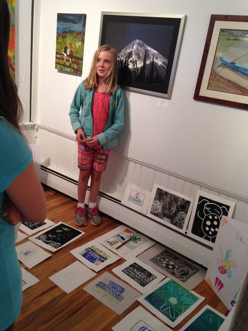
The week culminated in a discussion of the work accomplished throughout the week and a pizza party. We were able to create so much in just a week's time!
 |  |  |